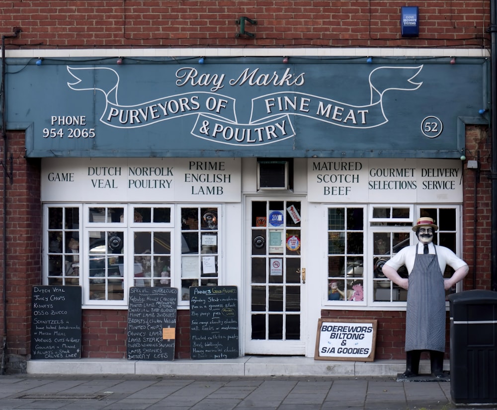
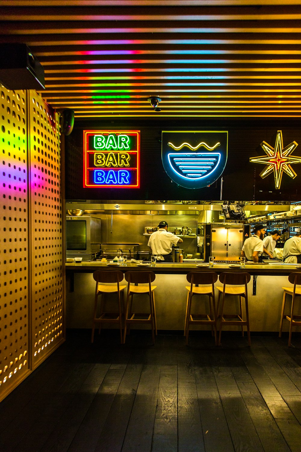
A good restaurant sign is an integral part of a restaurant business. No matter how much effort you put into your restaurant, all will be put into waste if you fail to reach out to your customers. And one sure way to drive customers into a restaurant is presenting them a restaurant sign that’s enticing enough for them to visit that restaurant.

Restaurant businesses should see how important of an investment restaurant signs are. An exceptional customer service, food, and location will be just effective if the customers and diners know where you are. Restaurant sign is both cost-efficient and effective. Compared to other ads and promotions such as TV ads, radio ads, and print ads that only run for some time, restaurant signs can reach a wider customer base without the restriction in demographic and display time.
Knowing how much it would help a restaurant, restaurant owners should know the elements of an effective restaurant sign. This is to make the most out of the investment made and make sure it’s being utilized to its highest potential. A restaurant sign is considered a great one if it has a legible font, accessible, a great logo, and a statement that would sway the customers into trying out the restaurant.
And since the restaurant industry is still trying to cope with the effects of the new safety and health protocols, signs can be as effective as they were. But that’s not the case! Launching a digital restaurant sign is just as effective as having a restaurant sign at your physical stores.
Here are the features of an effective restaurant sign and how it would help your restaurant business.
WHAT ARE THE TYPES OF RESTAURANT SIGN
Aside from digital restaurant signs, here are some of the most common types of restaurant signs you can check and see if it compliments your restaurant’s theme.
MONUMENT SIGNS

This type of restaurant sign establishes prominence and professionalism. These are stand-alone, large, street signs that can be seen and read by customers even from a distance. You can include your logo, and other marketing statements to welcome and greet customers. Wood panelling, metal, rocks, and all types of materials can be used for this type of restaurant sign.
PYLON SIGNS
Also known for its high visibility, this type of restaurant design is usually designed with pillars or poles. Pylon signs are those that are displayed at shopping centres with names of multiple businesses.
WALL SIGNS
Since this type of restaurant sign is usually mounted to the outdoor wall of the building, it doesn’t add much to the restaurant’s visibility. But with the proper materials used, and correct format, this type of restaurant sign can help you advertise your restaurant business.
BLADE SIGNS
A slim type restaurant sign that leaves no ground footprint to hinder the customers. Blade signs are those long and slim signs that run up and down the side of your establishment. This is a good option for those who are in crowded places because of its space-saving feature.
MENU SIGNS
This type of restaurant sign captures the attention of walk-by traffic, which are potential customers. Restaurant businesses may opt to display their menu and offers outside the establishment and stimulate a sense of urgency.
DIRECTIONAL SIGNS

Provide clear and easy communication of direction and information with this type of restaurant sign. The use of this restaurant sign will depend on your restaurant’s concept, but generally, you can use this to let your customers know which is which and where’s the location of the common places such as the bar, buffet, and comfort rooms.
DECORATIVE SIGNS
These are the restaurant signs that can help you highlight the theme of the restaurant. It will help you set the tone in your restaurant, and you can also use it to inform your customers as well.
ESSENTIAL FEATURES OF AN EFFECTIVE RESTAURANT SIGN
Here’s a list of the important elements you should check out to produce a well-created and effective restaurant sign.
LEGIBLE FONT
A sign is one of the first touchpoints of customers to a restaurant; that’s why it is ideal to use comprehensible fonts for customers to read what your sign has to say easily.
SIMPLE DESIGN

Some may find simple signs boring, but businesses should be aware that a complicated design may make it hard for customers to comprehend what the restaurant sign is trying to communicate to them. Also, keep in mind that the walk-by traffic and motorists usually just have seconds to interpret your restaurant sign. Keeping it simple makes it easier for a broader customer base and demographic to understand your message.
STRATEGICALLY-USED COLORS
Learn the psychology behind colours and make the colours you’ll use work for you. Research on the colours that increase the readability of a text or those that usually capture the customers’ eye. Just keep it consistent with your theme and keep it organized.
To give you an example, dark colours such as black make a text easier to understand if used as a background.
LOGO AND IMAGE THAT ARE EASY TO UNDERSTAND
The images and logos you’ll display should be easily recognized and can be associated with your restaurant brand. Give your customer a clearer view of your restaurant or diner and prevent them from having confusing ideas about it.
MARKETING STATEMENT

A sign should have a set of words or phrases that could help capture customers’ attention. It should stimulate their appetite and will make them want your restaurant’s food items more and make them feel that they’re missing a great deal if they won’t try out your restaurant. Just make sure you’ll use an easy-to-read font style and font size.
ACCESS TO MENU AND WEBSITE
An effective physical or digital restaurant sign includes a QR code that walk-by traffic and motorists can scan. This gives them access to your menu items as well as the price range. You can also include your social media pages such as Facebook, Google, Twitter, and Instagram page for users to learn more about your restaurant brand.
CONCLUSION
Restaurant signs, be it digital or physical, serve the restaurant business its main purpose- increase the restaurant’s visibility to customers. A sign is said to have a recall rate of 83%. It can also be used to run different marketing campaigns, build up the restaurant brand, set the restaurant’s tone and ambience, and communicate a targeted message.
Compared to your other marketing efforts, a sign requires you to spend a small part of your marketing expense, but it brings many benefits to the table. And even if you will seek help from experts, it will still be money well spent for your restaurant.
What are the types of restaurant signs you have on your restaurant business? Do they have the mentioned features? Let us know your thoughts!
source https://www.etakeawaymax.co.uk/essential-restaurant-sign-features/
No comments:
Post a Comment